MARCH 2021 – Nic & Wes Builders Pte Ltd Newsletter (Issue 130)

IN THE DETAILS By Nicole Kow
The minimalism movement has been a popular trend in recent years. Simplicity and low maintenance make a house practical but, details truly make it stellar. This month we delve into how adding in details can punch up the X-factor to a home’s aesthetics.
Accentuate The Profile
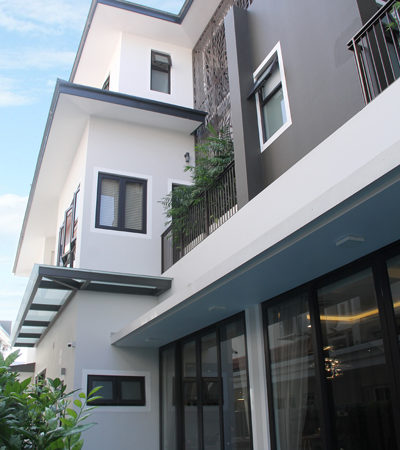
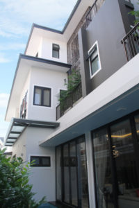
The shape of a façade can be dependent on a couple of factors before aesthetics comes to play. They can range from the floor plan as well as structural details
like beams and columns. But when it is time for aesthetics to shine, nooks and crannies can result in a unique frontage.
Adding in complementing and contrasting colours easily accentuates the profile. Similarly, a laser-cut feature can cleverly dress windows that may appear bland on its own.
Twist Up The Boundary
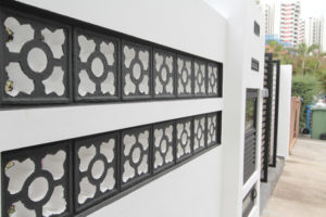
A boundary wall is the first thing one would see in addition to the façade of the home yet, it is highly overlooked. Dress up the bare wall with a contrasting colour, texture or material.
Paint On Point
The distinct beauty of a black & white home is seen with black line accents along white walls and windows. However, without these important details, the colonial home loses its distinct charm. With main colour to accent colour ratio, balance is key. This applies to exteriors in general that consist of more than one colour.
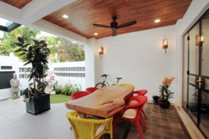
The ceiling can make a beautiful focal point to warm up an area while leaving walls bare. If minimalism is a theme of choice, simply adding wood or paint can be an ideal way to add a dose of character to the style while still keeping the overall aesthetic simple.
Accessorise To Elevate
Ponds set a tranquil mood to a space but what makes the difference between just having a waterhole in the floor and one that integrates nicely with the home? That is where accessorising the space with water features and stepping stones can elevate the original function and aesthetics of the pond.


